In bar charts values are plotted as either horizontal bars or vertical columns.
注意
The following settings affect the different chart types.
Switch between vertical and horizontal bar charts by setting type to col or bar 分别。
When using stacked charts the overlap needs to be set to 100.
If bars are horizontal, x and y axes are reversed.
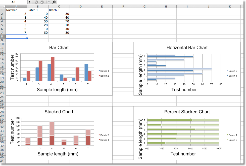
from openpyxl import Workbook
from openpyxl.chart import BarChart, Series, Reference
wb = Workbook(write_only=True)
ws = wb.create_sheet()
rows = [
    ('Number', 'Batch 1', 'Batch 2'),
    (2, 10, 30),
    (3, 40, 60),
    (4, 50, 70),
    (5, 20, 10),
    (6, 10, 40),
    (7, 50, 30),
]
for row in rows:
    ws.append(row)
chart1 = BarChart()
chart1.type = "col"
chart1.style = 10
chart1.title = "Bar Chart"
chart1.y_axis.title = 'Test number'
chart1.x_axis.title = 'Sample length (mm)'
data = Reference(ws, min_col=2, min_row=1, max_row=7, max_col=3)
cats = Reference(ws, min_col=1, min_row=2, max_row=7)
chart1.add_data(data, titles_from_data=True)
chart1.set_categories(cats)
chart1.shape = 4
ws.add_chart(chart1, "A10")
from copy import deepcopy
chart2 = deepcopy(chart1)
chart2.style = 11
chart2.type = "bar"
chart2.title = "Horizontal Bar Chart"
ws.add_chart(chart2, "G10")
chart3 = deepcopy(chart1)
chart3.type = "col"
chart3.style = 12
chart3.grouping = "stacked"
chart3.overlap = 100
chart3.title = 'Stacked Chart'
ws.add_chart(chart3, "A27")
chart4 = deepcopy(chart1)
chart4.type = "bar"
chart4.style = 13
chart4.grouping = "percentStacked"
chart4.overlap = 100
chart4.title = 'Percent Stacked Chart'
ws.add_chart(chart4, "G27")
wb.save("bar.xlsx")
This will produce four charts illustrating the various possibilities.
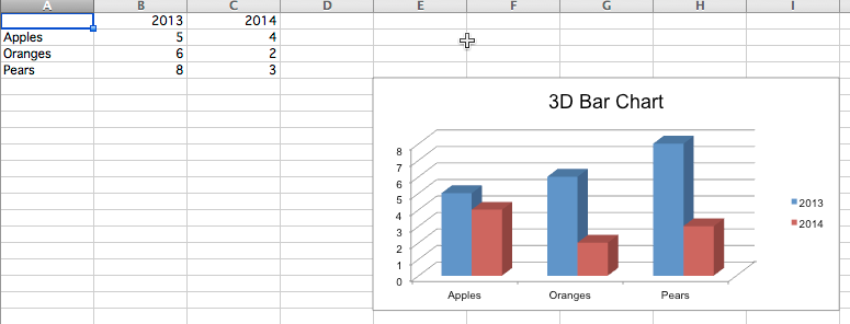
You can also create 3D bar charts
from openpyxl import Workbook
from openpyxl.chart import (
    Reference,
    Series,
    BarChart3D,
)
wb = Workbook()
ws = wb.active
rows = [
    (None, 2013, 2014),
    ("Apples", 5, 4),
    ("Oranges", 6, 2),
    ("Pears", 8, 3)
]
for row in rows:
    ws.append(row)
data = Reference(ws, min_col=2, min_row=1, max_col=3, max_row=4)
titles = Reference(ws, min_col=1, min_row=2, max_row=4)
chart = BarChart3D()
chart.title = "3D Bar Chart"
chart.add_data(data=data, titles_from_data=True)
chart.set_categories(titles)
ws.add_chart(chart, "E5")
wb.save("bar3d.xlsx")
This produces a simple 3D bar chart