OpenPyXL 3.0.7
  • 教程
  • 简单用法
  • 性能
  • 优化模式
  • 插入和删除行和列,移动单元格范围
  • 操纵 Pandas 和 NumPy
  • 图表
  • 注释
  • 操控样式
  • 额外工作表特性
  • 条件格式化
  • 数据透视表
  • 打印设置
  • 使用过滤器和排序
  • 验证单元格
  • 定义名称
  • 工作表表格
  • 剖析公式
  • 日期和时间
  • 保护
  • 开发
  • openpyxl 包
  • 3.0.7 (2021-03-09)
  • 3.0.6 (2021-01-14)
  • 3.0.5 (2020-08-21)
  • 3.0.4 (2020-06-24)
  • 3.0.3 (2020-01-20)
  • 3.0.2 (2019-11-25)
  • 3.0.1 (2019-11-14)
  • 3.0.0 (2019-09-25)
  • 2.6.4 (2019-09-25)
  • 2.6.3 (2019-08-19)
  • 2.6.2 (2019-03-29)
  • 2.6.1 (2019-03-04)
  • 2.6.0 (2019-02-06)
  • 2.6.-b1 (2019-01-08)
  • 2.6-a1 (2018-11-21)
  • 2.5.14 (2019-01-23)
  • 2.5.13 (brown bag)
  • 2.5.12 (2018-11-29)
  • 2.5.11 (2018-11-21)
  • 2.5.10 (2018-11-13)
  • 2.5.9 (2018-10-19)
  • 2.5.8 (2018-09-25)
  • 2.5.7 (2018-09-13)
  • 2.5.6 (2018-08-30)
  • 2.5.5 (2018-08-04)
  • 2.5.4 (2018-06-07)
  • 2.5.3 (2018-04-18)
  • 2.5.2 (2018-04-06)
  • 2.5.1 (2018-03-12)
  • 2.5.0 (2018-01-24)
  • 2.5.0-b2 (2018-01-19)
  • 2.5.0-b1 (2017-10-19)
  • 2.5.0-a3 (2017-08-14)
  • 2.5.0-a2 (2017-06-25)
  • 2.5.0-a1 (2017-05-30)
  • 2.4.11 (2018-01-24)
  • 2.4.10 (2018-01-19)
  • 2.4.9 (2017-10-19)
  • 2.4.8 (2017-05-30)
  • 2.4.7 (2017-04-24)
  • 2.4.6 (2017-04-14)
  • 2.4.5 (2017-03-07)
  • 2.4.4 (2017-02-23)
  • 2.4.3 (未发行)
  • 2.4.2 (2017-01-31)
  • 2.4.1 (2016-11-23)
  • 2.4.0 (2016-09-15)
  • 2.4.0-b1 (2016-06-08)
  • 2.4.0-a1 (2016-04-11)
  • 2.3.5 (2016-04-11)
  • 2.3.4 (2016-03-16)
  • 2.3.3 (2016-01-18)
  • 2.3.2 (2015-12-07)
  • 2.3.1 (2015-11-20)
  • 2.3.0 (2015-10-20)
  • 2.3.0-b2 (2015-09-04)
  • 2.3.0-b1 (2015-06-29)
  • 2.2.6 (未发行)
  • 2.2.5 (2015-06-29)
  • 2.2.4 (2015-06-17)
  • 2.2.3 (2015-05-26)
  • 2.2.2 (2015-04-28)
  • 2.2.1 (2015-03-31)
  • 2.2.0 (2015-03-11)
  • 2.2.0-b1 (2015-02-18)
  • 2.1.5 (2015-02-18)
  • 2.1.4 (2014-12-16)
  • 2.1.3 (2014-12-09)
  • 2.1.2 (2014-10-23)
  • 2.1.1 (2014-10-08)
  • 2.1.0 (2014-09-21)
  • 2.0.5 (2014-08-08)
  • 2.0.4 (2014-06-25)
  • 2.0.3 (2014-05-22)
  • 2.0.2 (2014-05-13)
  • 2.0.1 (2014-05-13) brown bag
  • 2.0.0 (2014-05-13) brown bag
  • 1.8.6 (2014-05-05)
  • 1.8.5 (2014-03-25)
  • 1.8.4 (2014-02-25)
  • 1.8.3 (2014-02-09)
  • 1.8.2 (2014-01-17)
  • 1.8.1 (2014-01-14)
  • 1.8.0 (2014-01-08)
  • 1.7.0 (2013-10-31)
  • 饼状图表

    饼状图表

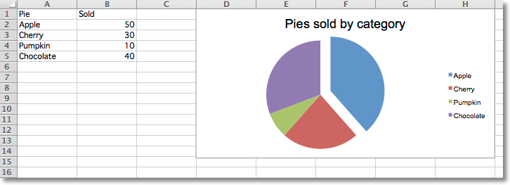
    Pie charts plot data as slices of a circle with each slice representing the percentage of the whole. Slices are plotted in a clockwise direction with 0° being at the top of the circle. Pie charts can only take a single series of data. The title of the chart will default to being the title of the series.

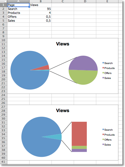
    from openpyxl import Workbook
    from openpyxl.chart import (
        PieChart,
        ProjectedPieChart,
        Reference
    )
    from openpyxl.chart.series import DataPoint
    data = [
        ['Pie', 'Sold'],
        ['Apple', 50],
        ['Cherry', 30],
        ['Pumpkin', 10],
        ['Chocolate', 40],
    ]
    wb = Workbook()
    ws = wb.active
    for row in data:
        ws.append(row)
    pie = PieChart()
    labels = Reference(ws, min_col=1, min_row=2, max_row=5)
    data = Reference(ws, min_col=2, min_row=1, max_row=5)
    pie.add_data(data, titles_from_data=True)
    pie.set_categories(labels)
    pie.title = "Pies sold by category"
    # Cut the first slice out of the pie
    slice = DataPoint(idx=0, explosion=20)
    pie.series[0].data_points = [slice]
    ws.add_chart(pie, "D1")
    ws = wb.create_sheet(title="Projection")
    data = [
        ['Page', 'Views'],
        ['Search', 95],
        ['Products', 4],
        ['Offers', 0.5],
        ['Sales', 0.5],
    ]
    for row in data:
        ws.append(row)
    projected_pie = ProjectedPieChart()
    projected_pie.type = "pie"
    projected_pie.splitType = "val" # split by value
    labels = Reference(ws, min_col=1, min_row=2, max_row=5)
    data = Reference(ws, min_col=2, min_row=1, max_row=5)
    projected_pie.add_data(data, titles_from_data=True)
    projected_pie.set_categories(labels)
    ws.add_chart(projected_pie, "A10")
    from copy import deepcopy
    projected_bar = deepcopy(projected_pie)
    projected_bar.type = "bar"
    projected_bar.splitType = 'pos' # split by position
    ws.add_chart(projected_bar, "A27")
    wb.save("pie.xlsx")
    					
    "Sample pie chart"

    投影饼状图表

    Projected pie charts extract some slices from a pie chart and project them into a second pie or bar chart. This is useful when there are several smaller items in the data series. The chart can be split according to percent, val(ue) or pos(ition). If nothing is set then the application decides which to use. In addition custom splits can be defined.

    "Sample pie chart with projections"

    3D 饼状图表

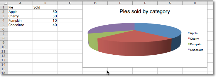
    Pie charts can also be created with a 3D effect.

    from openpyxl import Workbook
    from openpyxl.chart import (
        PieChart3D,
        Reference
    )
    data = [
        ['Pie', 'Sold'],
        ['Apple', 50],
        ['Cherry', 30],
        ['Pumpkin', 10],
        ['Chocolate', 40],
    ]
    wb = Workbook()
    ws = wb.active
    for row in data:
        ws.append(row)
    pie = PieChart3D()
    labels = Reference(ws, min_col=1, min_row=2, max_row=5)
    data = Reference(ws, min_col=2, min_row=1, max_row=5)
    pie.add_data(data, titles_from_data=True)
    pie.set_categories(labels)
    pie.title = "Pies sold by category"
    ws.add_chart(pie, "D1")
    wb.save("pie3D.xlsx")
    					
    "Sample 3D pie chart"

    渐变饼状图表

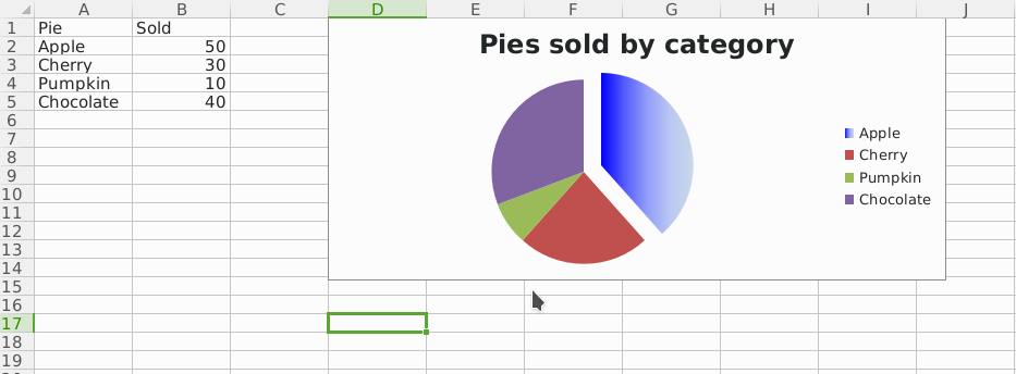
    Pie charts can also be created with gradient series.

    ..literalinclude:: pie-gradient.py

    "Sampe gradient pie chart"