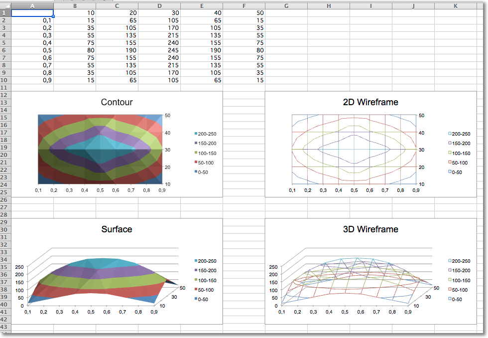
Data that is arranged in columns or rows on a worksheet can be plotted in a surface chart. A surface chart is useful when you want to find optimum combinations between two sets of data. As in a topographic map, colors and patterns indicate areas that are in the same range of values.
By default all surface charts are 3D. 2D wireframe and contour charts are created by setting the rotation and perspective.
from openpyxl import Workbook
from openpyxl.chart import (
    SurfaceChart,
    SurfaceChart3D,
    Reference,
    Series,
)
from openpyxl.chart.axis import SeriesAxis
wb = Workbook()
ws = wb.active
data = [
    [None, 10, 20, 30, 40, 50,],
    [0.1, 15, 65, 105, 65, 15,],
    [0.2, 35, 105, 170, 105, 35,],
    [0.3, 55, 135, 215, 135, 55,],
    [0.4, 75, 155, 240, 155, 75,],
    [0.5, 80, 190, 245, 190, 80,],
    [0.6, 75, 155, 240, 155, 75,],
    [0.7, 55, 135, 215, 135, 55,],
    [0.8, 35, 105, 170, 105, 35,],
    [0.9, 15, 65, 105, 65, 15],
]
for row in data:
    ws.append(row)
c1 = SurfaceChart()
ref = Reference(ws, min_col=2, max_col=6, min_row=1, max_row=10)
labels = Reference(ws, min_col=1, min_row=2, max_row=10)
c1.add_data(ref, titles_from_data=True)
c1.set_categories(labels)
c1.title = "Contour"
ws.add_chart(c1, "A12")
from copy import deepcopy
# wireframe
c2 = deepcopy(c1)
c2.wireframe = True
c2.title = "2D Wireframe"
ws.add_chart(c2, "G12")
# 3D Surface
c3 = SurfaceChart3D()
c3.add_data(ref, titles_from_data=True)
c3.set_categories(labels)
c3.title = "Surface"
ws.add_chart(c3, "A29")
c4 = deepcopy(c3)
c4.wireframe = True
c4.title = "3D Wireframe"
ws.add_chart(c4, "G29")
wb.save("surface.xlsx")