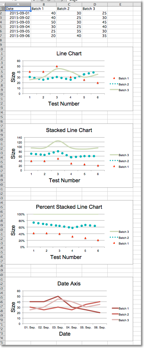
Line charts allow data to be plotted against a fixed axis. They are similar to scatter charts, the main difference is that with line charts each data series is plotted against the same values. Different kinds of axes can be used for the secondary axes.
Similar to bar charts there are three kinds of line charts: standard, stacked and percentStacked.
from datetime import date
from openpyxl import Workbook
from openpyxl.chart import (
    LineChart,
    Reference,
)
from openpyxl.chart.axis import DateAxis
wb = Workbook()
ws = wb.active
rows = [
    ['Date', 'Batch 1', 'Batch 2', 'Batch 3'],
    [date(2015,9, 1), 40, 30, 25],
    [date(2015,9, 2), 40, 25, 30],
    [date(2015,9, 3), 50, 30, 45],
    [date(2015,9, 4), 30, 25, 40],
    [date(2015,9, 5), 25, 35, 30],
    [date(2015,9, 6), 20, 40, 35],
]
for row in rows:
    ws.append(row)
c1 = LineChart()
c1.title = "Line Chart"
c1.style = 13
c1.y_axis.title = 'Size'
c1.x_axis.title = 'Test Number'
data = Reference(ws, min_col=2, min_row=1, max_col=4, max_row=7)
c1.add_data(data, titles_from_data=True)
# Style the lines
s1 = c1.series[0]
s1.marker.symbol = "triangle"
s1.marker.graphicalProperties.solidFill = "FF0000" # Marker filling
s1.marker.graphicalProperties.line.solidFill = "FF0000" # Marker outline
s1.graphicalProperties.line.noFill = True
s2 = c1.series[1]
s2.graphicalProperties.line.solidFill = "00AAAA"
s2.graphicalProperties.line.dashStyle = "sysDot"
s2.graphicalProperties.line.width = 100050 # width in EMUs
s2 = c1.series[2]
s2.smooth = True # Make the line smooth
ws.add_chart(c1, "A10")
from copy import deepcopy
stacked = deepcopy(c1)
stacked.grouping = "stacked"
stacked.title = "Stacked Line Chart"
ws.add_chart(stacked, "A27")
percent_stacked = deepcopy(c1)
percent_stacked.grouping = "percentStacked"
percent_stacked.title = "Percent Stacked Line Chart"
ws.add_chart(percent_stacked, "A44")
# Chart with date axis
c2 = LineChart()
c2.title = "Date Axis"
c2.style = 12
c2.y_axis.title = "Size"
c2.y_axis.crossAx = 500
c2.x_axis = DateAxis(crossAx=100)
c2.x_axis.number_format = 'd-mmm'
c2.x_axis.majorTimeUnit = "days"
c2.x_axis.title = "Date"
c2.add_data(data, titles_from_data=True)
dates = Reference(ws, min_col=1, min_row=2, max_row=7)
c2.set_categories(dates)
ws.add_chart(c2, "A61")
wb.save("line.xlsx")
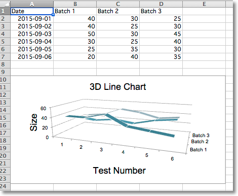
In 3D line charts the third axis is the same as the legend for the series.
from datetime import date
from openpyxl import Workbook
from openpyxl.chart import (
    LineChart3D,
    Reference,
)
from openpyxl.chart.axis import DateAxis
wb = Workbook()
ws = wb.active
rows = [
    ['Date', 'Batch 1', 'Batch 2', 'Batch 3'],
    [date(2015,9, 1), 40, 30, 25],
    [date(2015,9, 2), 40, 25, 30],
    [date(2015,9, 3), 50, 30, 45],
    [date(2015,9, 4), 30, 25, 40],
    [date(2015,9, 5), 25, 35, 30],
    [date(2015,9, 6), 20, 40, 35],
]
for row in rows:
    ws.append(row)
c1 = LineChart3D()
c1.title = "3D Line Chart"
c1.legend = None
c1.style = 15
c1.y_axis.title = 'Size'
c1.x_axis.title = 'Test Number'
data = Reference(ws, min_col=2, min_row=1, max_col=4, max_row=7)
c1.add_data(data, titles_from_data=True)
ws.add_chart(c1, "A10")
wb.save("line3D.xlsx")