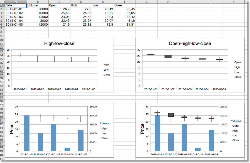
Data that is arranged in columns or rows in a specific order on a worksheet can be plotted in a stock chart. As its name implies, a stock chart is most often used to illustrate the fluctuation of stock prices. However, this chart may also be used for scientific data. For example, you could use a stock chart to indicate the fluctuation of daily or annual temperatures. You must organize your data in the correct order to create stock charts.
The way stock chart data is organized in the worksheet is very important. For example, to create a simple high-low-close stock chart, you should arrange your data with High, Low, and Close entered as column headings, in that order.
Although stock charts are a distinct type, the various types are just shortcuts for particular formatting options:
Volume can be added by combining the stock chart with a bar chart for the volume.
from datetime import date
from openpyxl import Workbook
from openpyxl.chart import (
    BarChart,
    StockChart,
    Reference,
    Series,
)
from openpyxl.chart.axis import DateAxis, ChartLines
from openpyxl.chart.updown_bars import UpDownBars
wb = Workbook()
ws = wb.active
rows = [
   ['Date',      'Volume','Open', 'High', 'Low', 'Close'],
   ['2015-01-01', 20000,    26.2, 27.20, 23.49, 25.45,  ],
   ['2015-01-02', 10000,    25.45, 25.03, 19.55, 23.05, ],
   ['2015-01-03', 15000,    23.05, 24.46, 20.03, 22.42, ],
   ['2015-01-04', 2000,     22.42, 23.97, 20.07, 21.90, ],
   ['2015-01-05', 12000,    21.9, 23.65, 19.50, 21.51,  ],
]
for row in rows:
    ws.append(row)
# High-low-close
c1 = StockChart()
labels = Reference(ws, min_col=1, min_row=2, max_row=6)
data = Reference(ws, min_col=4, max_col=6, min_row=1, max_row=6)
c1.add_data(data, titles_from_data=True)
c1.set_categories(labels)
for s in c1.series:
    s.graphicalProperties.line.noFill = True
# marker for close
s.marker.symbol = "dot"
s.marker.size = 5
c1.title = "High-low-close"
c1.hiLowLines = ChartLines()
# Excel is broken and needs a cache of values in order to display hiLoLines :-/
from openpyxl.chart.data_source import NumData, NumVal
pts = [NumVal(idx=i) for i in range(len(data) - 1)]
cache = NumData(pt=pts)
c1.series[-1].val.numRef.numCache = cache
ws.add_chart(c1, "A10")
# Open-high-low-close
c2 = StockChart()
data = Reference(ws, min_col=3, max_col=6, min_row=1, max_row=6)
c2.add_data(data, titles_from_data=True)
c2.set_categories(labels)
for s in c2.series:
    s.graphicalProperties.line.noFill = True
c2.hiLowLines = ChartLines()
c2.upDownBars = UpDownBars()
c2.title = "Open-high-low-close"
# add dummy cache
c2.series[-1].val.numRef.numCache = cache
ws.add_chart(c2, "G10")
# Create bar chart for volume
bar = BarChart()
data =  Reference(ws, min_col=2, min_row=1, max_row=6)
bar.add_data(data, titles_from_data=True)
bar.set_categories(labels)
from copy import deepcopy
# Volume-high-low-close
b1 = deepcopy(bar)
c3 = deepcopy(c1)
c3.y_axis.majorGridlines = None
c3.y_axis.title = "Price"
b1.y_axis.axId = 20
b1.z_axis = c3.y_axis
b1.y_axis.crosses = "max"
b1 += c3
c3.title = "High low close volume"
ws.add_chart(b1, "A27")
## Volume-open-high-low-close
b2 = deepcopy(bar)
c4 = deepcopy(c2)
c4.y_axis.majorGridlines = None
c4.y_axis.title = "Price"
b2.y_axis.axId = 20
b2.z_axis = c4.y_axis
b2.y_axis.crosses = "max"
b2 += c4
ws.add_chart(b2, "G27")
wb.save("stock.xlsx")
警告
Due to a bug in Excel high-low lines will only be shown if at least one of the data series has some dummy values. This can be done with the following hack:
from openpyxl.chart.data_source import NumData, NumVal
pts = [NumVal(idx=i) for i in range(len(data) - 1)]
cache = NumData(pt=pts)
c1.series[-1].val.numRef.numCache = cache